Interior decoration refers to the choices of materials, colors, furniture, and layout that define the atmosphere of a living space. These choices are not solely aesthetic; they influence the flow within a room, the perception of volumes, and everyday comfort. Several movements characterize the current period, with a pronounced return to raw materials, vintage objects, and deeper color palettes.
Panoramic wallpaper: a zoning tool for multifunctional spaces
Wallpaper is no longer limited to a decorative background role. In homes where a single room serves multiple functions (office, living room, guest bedroom), it helps to visually delineate a use without partitioning. A panoramic strip placed behind an integrated desk in the living room is enough to create a clear visual break without losing an inch of space.
Pinterest data cited by La Voix du Nord indicates that searches for panoramic wallpaper have increased by 191% between the first quarters of 2024 and 2025 in France. This rise reflects a concrete need: to structure open spaces that have become the norm in recent constructions and renovations.
For zoning to work, the pattern must contrast with the rest of the wall without clashing with adjacent furniture. A dark foliage panoramic on a light wall creates depth that anchors the work area, while a subtle geometric pattern may suffice to signal a reading nook.
A common mistake is to place a panoramic on a wall already loaded with shelves or frames: the zoning effect disappears under the accumulation. To find suitable references for this type of project, browsing the Créa Décor website for decoration allows you to spot ranges categorized by use and room style.
Chrome finishes and mixed metals: replacing all-brass
Brass has dominated decorative finishes for several years, from door handles to light fixtures. Chrome is making a comeback as an alternative, according to an analysis by Idealista reported by Le Réseau des Achats in September 2026. This return does not replicate the cold aesthetic of the 2000s: chrome now combines with dark wood and textured stone.
Specifically, pairing a polished chrome lamp base with a walnut table or a travertine console creates a visual temperature contrast. Chrome captures light and enlarges the perceived space, while wood absorbs and warms. This complementarity works particularly well in north-facing living spaces, where natural light lacks intensity.
The challenge lies in the balance. Three different metallic finishes in the same room (chrome, brass, matte black) can coexist if one dominates more than half of the visible metal surfaces. Beyond three, the eye doesn’t know where to settle. It’s better to choose one main metal and one accent metal.
Interior decoration “collected over time”: mixing eras without a flea market effect
The 2026 trends report from Houzz, based on interviews with design professionals and reported by Benin Web TV, identifies the “collected over time” style as a direct response to the standardization of interiors. The principle: an interior that seems to have been gradually assembled, with antique furniture, vintage finds, and craftsmanship, rather than a set purchased in a single order.
This mix of eras only works if a common thread connects the pieces. Here are the most reliable anchors to avoid a disordered accumulation effect:
- A limited color palette (three shades maximum) applied to textiles and walls, which unifies furniture from different periods
- A recurring material, such as raw wood or rattan, present in at least two rooms in varied forms (seating, storage, lighting)
- A consistency of proportion: a 1950s club chair dialogues better with a mid-century coffee table than with a Louis XV console, because their lines share a structural simplicity
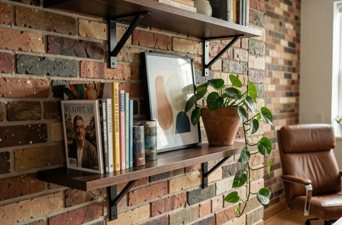
Craftsmanship plays a key role in this approach. A handmade ceramic, a wall weaving, or a piece of marquetry brings an irregularity that industrial furniture cannot replicate. This irregularity is precisely what gives the interior its lived-in character.
Deep colors and natural materials: autumn palette all year round
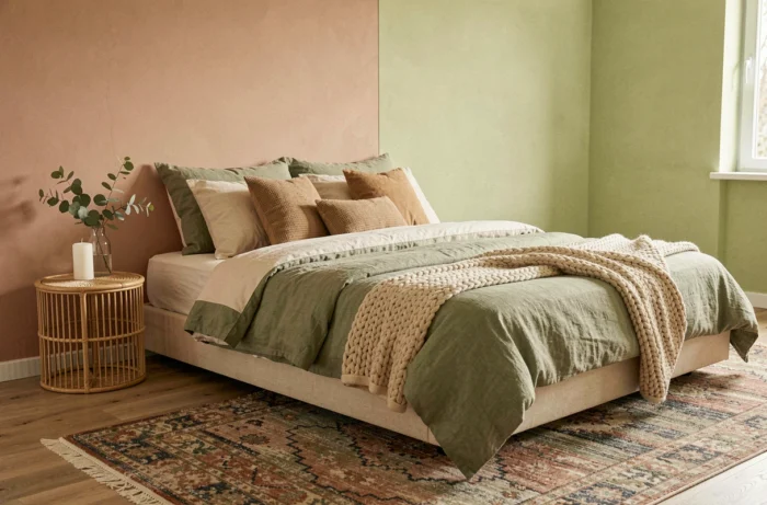
Wine red and Mocha Mousse (Pantone color 2025) continue to influence decorative choices well beyond their launch season. These deep colors share a technical commonality: they absorb light instead of reflecting it, which alters the perception of a room’s volume.
A wall painted in burgundy in a large living room visually reduces distance and creates a sense of enveloping. In a small room, the same burgundy applied to a single wall, combined with three light walls, draws the eye without overwhelming the space. The basic rule remains to apply a saturated color to the surface farthest from the main light source.
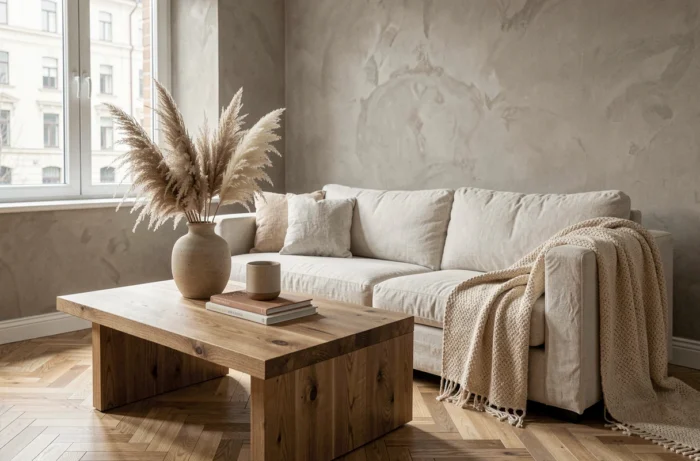
These shades naturally pair with raw materials: washed linen, natural stone, unvarnished wood. Linen absorbs surrounding pigments and softens overly stark contrasts. Stone (travertine, terrazzo) brings an irregular texture that breaks the monotony of a flat color. Dark wood, particularly walnut, enhances depth without adding extra color.
Reuse of materials: a decorative and regulatory angle
The reuse of construction elements (doors, cast iron radiators, antique floorboards) constitutes a decorative avenue still underexplored in inspiration articles, even though it meets a dual aesthetic and regulatory logic. Integrating reclaimed oak flooring into a renovation does not yield the same result as new flooring: variations in patina, signs of wear, and slight differences in hue between the boards create a living floor.
Old cast iron radiators, once stripped and repainted, become character elements that contemporary models do not replicate. A reclaimed workshop glass door can serve as a partition between the kitchen and living room, often at a lower cost than a new custom-made glass wall.
The practical challenge of reuse remains the verification of the structural condition of the recovered pieces. An old floorboard may contain traces of treatments now banned. Each reused element requires inspection before integration into the project.