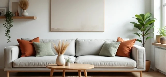
What palettes, materials, and composition principles truly distinguish a contemporary interior from a dated decor? The answer does not lie in a single choice of color or furniture, but in the combination of several decorative levers whose effectiveness varies depending on the room and its use. This article compares the approaches that structure interior decoration in 2026, from warm neutrals to biophilic design, to identify those that produce a visible result with the least technical effort.
Warm Neutrals vs. Bright Colors: What Each Palette Brings to a Space
The dominant trend relies on warm neutrals like greige and sandy tones, used in layers on walls, textiles, and furniture. According to the Maison & Travaux report on bedroom trends for 2026, designers recommend tone-on-tone (layering several shades of the same color on headboards, wallpaper, throws) as a simple method to achieve a warm ambiance without technical risk.
In contrast, bright colors retain their usefulness in transitional spaces or small areas where an accent wall creates immediate visual depth. The difference in difficulty between the two approaches merits a comparison.
| Criterion | Warm Neutrals Palette (Tone-on-Tone) | Bright Colors Palette (Accent Wall) |
|---|---|---|
| Implementation Difficulty | Low: close shades forgive discrepancies | Medium: contrast requires precise color choice |
| Suitable Rooms | Bedroom, living room, common areas | Entryway, office, bathroom |
| Risk of Weariness | Low: timeless palette | Higher: a strong color can date |
| Average Budget | Low (paint + coordinated textiles) | Low (only one surface to paint) |
| Effect on Brightness | Amplifies natural light | Absorbs light on the painted wall |
Tone-on-tone remains the most accessible solution for those seeking a coherent result without hiring a professional. The resources dedicated to interior decoration on Ta Maison Ton Jardin detail several situational examples of this type of palette in common living spaces.
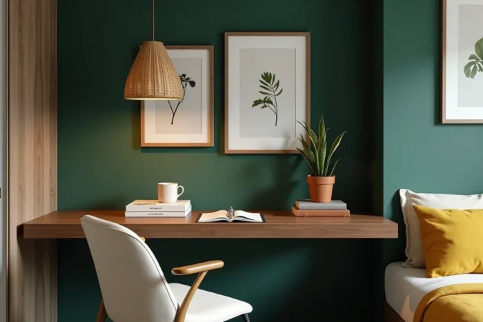
Biophilic Design in Residential Decoration: Beyond Green Plants
Biophilic design goes beyond the mere presence of plants on a shelf. Market analyses of interior design identify this approach as a major axis of the residential sector, driven by the demand for well-being at home. The principle relies on four combined levers.
- Raw and unprocessed materials (solid wood, stone, linen, terracotta) replace smooth and uniform surfaces to introduce organic texture into each room.
- Optimizing natural light involves choosing filtering curtains rather than blackout ones, placing mirrors opposite windows, and removing tall furniture in front of light sources.
- Plants are not isolated accessories but form a system: grouping several species of varying sizes creates a mass effect that visually anchors a corner of the room.
- A view of the outside, even partial, becomes a decorative element in its own right. An unobstructed window frame is often better than a painting.
This approach works particularly well in south or west-facing rooms, where natural light enhances the effect of raw materials. In a dark room, it requires more effort in artificial lighting to avoid a dull appearance.
Furniture and Objects: The Choice That Structures the Entire Decoration
Furniture determines the reading of a space more than wall color. An oversized sofa in a medium-sized living room negates the effect of any palette, no matter how trendy it is.
The most effective rule for a balanced interior remains that of proportions. A piece of furniture should not occupy more than one-third of the visible floor area in the zone where it is placed. This ratio leaves enough circulation and empty space for the eye to breathe.
Wall Art and Paintings: Frame Rather Than Accumulate
The accumulation of frames on a wall (the famous gallery wall) remains popular, but the current trend favors a reduced number of larger pieces. A single generously sized painting placed above a low piece of furniture creates a more readable focal point than a mosaic of small frames.
For the remaining walls, discreet patterned wallpaper or textured panels offer an alternative that dresses the surface without requiring hanging. This solution is suitable for renters who cannot drill into the walls.
Room by Room: Where to Focus Decorative Efforts for a Visible Result
Not all rooms deserve the same investment in time and budget. The living room and bedroom are the two spaces where decorative choices are most noticeable, as we spend the most time there and observe them from a static position (sitting or lying down).
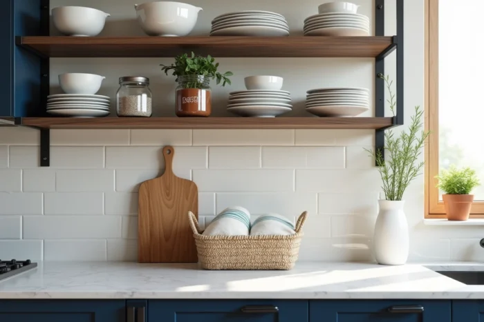
The kitchen, on the other hand, benefits more from functional changes (visible storage, clear countertop) than from purely aesthetic additions. The new kitchen trends identified by Archiproducts confirm that the readability of the countertop matters more than the style of accessories in the overall perception of a well-kept kitchen.
The entryway remains the most underestimated lever. A mirror, targeted lighting, and closed storage are enough to transform the first impression of a home, for a budget limited to a few elements.
Choosing to concentrate efforts on two or three rooms rather than sprinkling changes everywhere produces a sharp contrast between the treated spaces and the rest of the home, which paradoxically enhances the perceived coherence of the whole. An interior where everything has been redone to the same degree often lacks visual hierarchy.